The first time I used a BI tool, I was confused by the difference between "dimensions" and "measures.
I will try to briefly explain the differences and ideas here.
name
- In Tableau, they are called "dimensions" and "measures".
- In PowerBI, they are called "columns" and "measures.
- Looker calls them "dimensions" and "metrics.
Although they are called differently, they all refer to the same content.
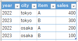
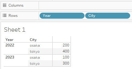
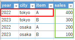
sample data
This explanation is based on the following sales data by year, city, and product.
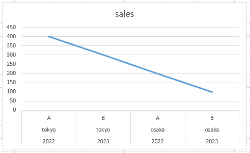
Graphs in Excel
Excel draws a graph by plotting the data in the table as it is, one-to-one.
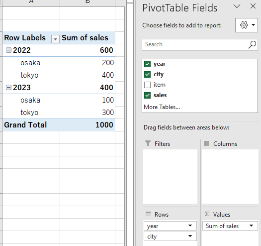
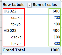
Aggregate graphs in Excel
Sometimes we want to draw a graph of the totaled values by year, city, etc.
In Excel, such graphs cannot be created as-is, but rather must be tabulated in a pivot table and then plotted with the values from that pivot table.
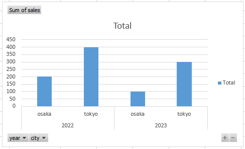
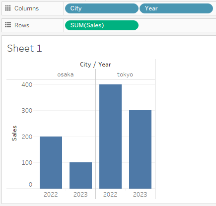
Graphs in BI Tools
The confusion stems from the fact that people think of graphs in BI tools the same way they think of graphs in Excel.
A graph in a BI tool is not a one-to-one plot of values like a graph in Excel, but rather a plot of results once aggregated in a group, like a pivot table.
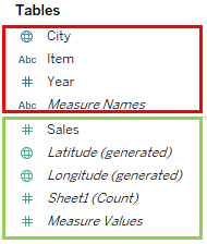
What are "dimensions" and "measures?"
- Dimensions" are groupings (red)
- Measure" is the value to be grouped and aggregated (green)
This can be said to be the case.
A "dimension" refers to an individual value, whereas a "measure" refers to a grouped set of values.
If you can visualize this labeling and set values, I think you will not be confused by "dimension" and "measure".
Why BI tools are useful
When plotting graphs in Excel, in most cases, you create a tabulation table for the graph once and plot the graph using that table.
BI tools do the work of creating that tally table, which makes the graphing work easier than with Excel.