I usually use Tableau or PowerBI, but there are times when I don't want to use them, but want to quickly display a graph and check the data.
I thought it might be useful to know about the Google Data Portal for such occasions, so I put together a brief overview of how to use it.
What is Google Data Portal?
It used to be called Google Data Studio, but the name has been changed to Data Portal, probably due to trademark issues. (The English name remains Google DataStudio)
Google Data Portal is a graphing and graph distribution tool similar to Tableau and PowerBI. Data is obtained from external sources via a connector, and the graphs created can be viewed on the web.

About Data Sources
There are not many practical connectors, mainly the following. I really wanted to handle Azure SQL Database, S3, and Excel files, but alas.... Well, it's a free tool and not too extravagant.
- Google BigQuery
- Google Spreadsheets
- Google Analytics
- CSV File
- MySQL
- PostgreSQL
Explanation of terms: "report", "page", "data source".
A "report" is the largest unit of output. (something like an Excel book).
- The "Report" can contain multiple graphs.
- A "report" can have multiple "pages". (something like an Excel sheet).
- A "report" can have multiple "data sources.
- A "data source" is the data to be graphed. (something like a database table).
- Data Sources" are independent of "Reports" and are created separately from "Reports.
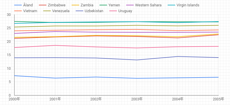
Below is an actual simple graph.
Data Source Creation
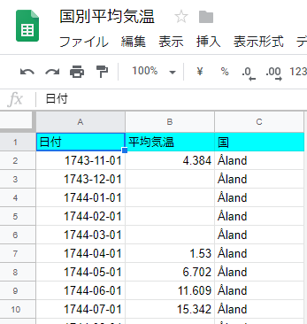
Since it seems that data registered on kaggle can be used directly as a data source, we used the following country-specific temperature data.
I wanted to go to ......, but the graph creation was incredibly slow, so I downloaded the data in CSV and then made a Google spreadsheet of it and used that as the data source.
[Data Portal] - [Data Sources] - <Plus icon in lower right corner>. to display the list of connectors, select "Google Spreadsheet" from the list, and then select the Google Spreadsheet of the temperature data you have prepared. Then, a data source will be created based on the data in this Google Spreadsheet.
If there is other data like this that you want to use, you can register it as a data source as you go along.
(However, as discussed below, there is no UI for adding data sources, and you must add a new data source by adding an empty graph once and then assigning the data source you want to add to that graph.)
Creating Reports
Click on [Data Portal] - [Reports] - <Plus icon for starting a new report>. to create a new report.
When "Add Data Source" appears, select the data source you just created. The selected data source will then be added as a data source for use in this report.
Graphing
But first, a note of caution. The report has "edit mode" and "view mode," which can be switched using the icon in the upper right corner. The contents of the graph can be displayed in "edit mode," but it may not display properly, so it is better to switch to "view mode" frequently to check the contents.
Graph creation is done from the [Add Graph] menu. Here we have chosen "Period > Time Series Graph".
The properties of the selected graph are displayed on the right side of the screen, where the graph can be adjusted.
Here is a brief description of the "Data" property of the graph
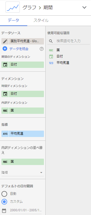
- Select the source data to be graphed.
Dimensions of the period
- If the data is time series data, the range of data to be displayed can be narrowed down to a period of time. At that time, you can specify here which column of the data represents time.
time dimension
- You decide here whether the time interval of the graph should be hours, days, months, years, etc.
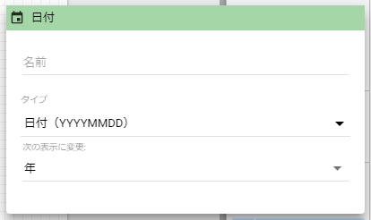
Click on the calendar icon to display the "Date" dialog box.Change to next view.Set the interval with
- Attention!I don't mess with "type." (I got into this because I mistakenly thought this was where you set the time interval.)
- Since we are going to graph the "average annual temperature" here** "Change to the following display".をMake it a "year "**.
breakdown dimension
- The graph can be subdivided by item.
- In this section, we will try to display the graph by country, so we will select "Country".
dimension
- These are items that appear in graphs other than "time series graphs."
- In short, decide here which column to use for the X axis.
- Some graphs allow multiple dimensions to be registered, in which case the graph is subdivided starting from the top dimension.
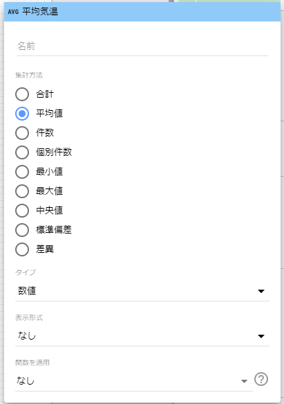
indicator
- A graph is a visualization of some numerical value, but what the value is is determined here.
- Multiple indicators can be registered, and formulas can be included, just like formulas in Excel.
- Since we are going to graph the average temperature here, the indicator is "average temperature" and the aggregation method is "average value" (AVG).
Sort breakdown dimensions
- In the "Time Series Graph," data is naturally arranged in time series, but if the graphs are displayed separately in the "Breakdown Dimension," the order of the separate graphs can be specified here.
sort
- These are items that appear in graphs other than "time series graphs."
- Decide what rules will be used to arrange the X axis.
Default Date Range
- This is where the "duration dimension" from above is used.
- Determine which date range data will be displayed for the columns specified in the "Period Dimension."
- Here we will try to display "2000-2003", so the range will be "2000/1/1 - 2013/12/31".
filter (esp. camera)
- If there are other conditions besides date ranges to refine the data, we will add them here.
- Filter" and "Default date range" are both filters.What we are doing is the same.but I use date-related filters a lot.Only the "date range" is different.(I didn't notice it at first and was confused...). (I didn't notice it at first and was confused...)
This will display a graph of the average annual temperature for each country for the years 2000-2003.
Interactively change date ranges/filters
Date ranges/filters can be changed arbitrarily by the user in the GUI.
- Insert UI by [Insert]-[Duration] or [Filter Options
- For filters, set "Data Source" and "Dimension
- Change report to view mode
The user can then arbitrarily set filters for date ranges and dimensions.
However, the date range of the graph must be set to "Auto". Also, the UI must be set to "View Mode" to operate.
Set date ranges and filters for the entire report
The date ranges and filters set in the "Data" section of the graph areonly within that graph.Valid.
Set that up.Same for all graphsto set the date range/filter for the entire report.
- [File]-[Report Settings]
- Set "Data Source," "Period Dimension," "Default Date Range," and "Filters."
Adding and Deleting Data Sources
It is possible to register multiple data sources in a report and display mixed graphs of multiple data sources in a single report.
Adding Data Sources
Adding a pre-created data source to a report is a bit tricky
- Add any appropriate graphs.
- Click on the graph and select [Data]-[Data Source] in the right window.
- Click on the BUTT icon of a data source that is already displayed to delete it
- Click on "Select Data Source" when it appears and select the data source you have already created from "Available Data Sources".
then it will be registered.
Deletion of data source
The [Resources]-[Manage Added Data Sources]. menu displays a list of registered data sources, which can be deleted.
Other
- BigQuery can be a data source not only for tables, but also for query results.
impressions
With the above, I think we have covered all the points that are easy to get stuck on, and you should be able to display basic graphs quickly and easily. I think you should be able to make basic graph display quickly and easily.
The usability seems to be similar to PowerBI. The type of data source is quite Google-oriented, and the fact that it cannot be used for everything is quite a negative.